Module 1 – Introduction
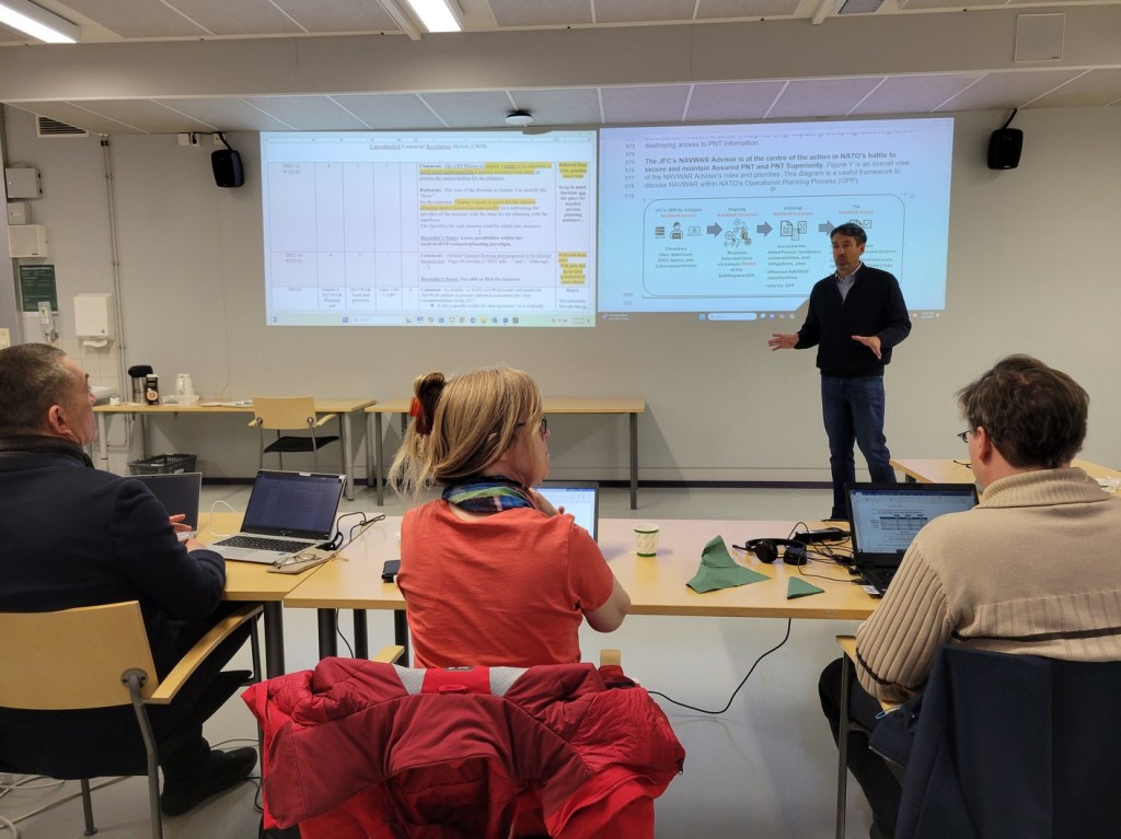
Hello, classmates. I’m Joe, the guy standing in the background with my hands spread out like I’m throwing knowledge out to my audience (L to R: a German, a Brit, and a Finn). I’ve made slow progress through the UNM Rhetoric and Writing program based on having to travel and do work like you see above (… mostly teaching technical ideas across cultures who don’t necessarily agree…).
I’ve been interested in technical communications since before I can remember – I just didn’t have the vocabulary for it. The ideas about what I’ve been interested in *as* technical communications didn’t coalesce until my 3rd year at UNM in the English program. But for some odd reason – as seen below – even when I’m traveling for work or seeing the sights for fun, I tend to drift towards some sort of visual and technical information exchange (see below)

In recognition of Dr. Newmark’s experience in Suomi (Finland), I’ve selected two images that represent eye-catching visuals seen on my trip to Helsinki. The image above shows instructions about common courtesy on the Helsinki train system. The visuals are clear, lines are distinct, colors are appropriate, and translated into three languages: Finnish, Swedish, and English. I love the design philosophy of the Finns, even though I could not adequately describe to you what those ideas entail.
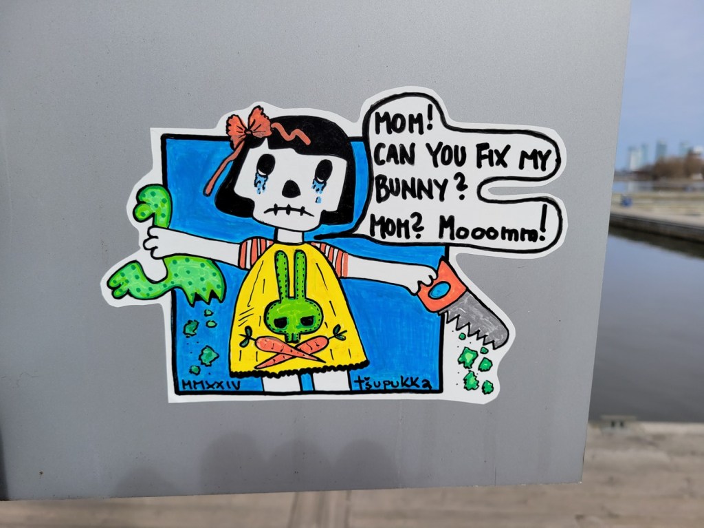
The absurdist sense of Finnish humor comes out in this sticker. The bunny skull looks familiar (unknown if it is of Finnish origin), but the idea presented – a child asking for help as it disembowels her stuffed animal – made me laugh out loud for its absurdity as much as its color and design.
As with many things in my life, I’d love to know why I do or shoot things that I do while on travel. That level of understanding visual rhetoric “beyond” is what I hope to achieve with this class. – Fin –
Module 2 – What is Visual Rhetoric?

For this week’s readings, I found the analysis of John Berger’s Ways of Seeing to be most refreshing and insightful. The early chapters are shocking enough to this neatherthalic rube (me) to begin thinking beyond the images themselves and place them in “a” correct time, place, or context. Berger’s thesis on the separation of meaning from a painting based on its mechanical reproduction and display “elsewhere” had never really occurred to me.
There’s a story attached to the image above, one I’m not apt to discuss in polite company. So I will start the tale the best I know how: “There I was…”
There I was in the Museo Nacional Del Prado, taking advantage of the free admission during the last two hours of the day. While inside I was floored by the artistry and detail on this painting: Gonzalo Fernández de Córdoba at the Battle of Cerignola by Federico de Madrazo. I am guilty, through the image cropped above, of doing what Berger mentions as “isolating a detail from the painting from the whole. ” This was unintentional, because I was yelled at by a security guard about taking photos of painting inside the Prado and wasn’t able to step back and capture the entire image. I believe his warning was more for physical protection of the paintings (against flash photography), but the guard’s protests make a different sense now with the shifting of the painting’s meaning. I cropped out so much of this (after getting yelled at), the original context the image is completely lost. Can you tell there was a battle? Can you tell the size of the royal’s entourage greeting the subjects shown? No, these core details were lost by my reproduction.
Walter Benjamin’s treatise The Work of Art in the Age of Mechanical Reproduction, shows how the advances in technology speed this context separation. Starting with the Greeks, reproductions were limited to small pieces – commodities, if you will – such as coins and bronze statues. Anything larger required physical presence of the observer at the site of the art. Being able to reproduce art anywhere has changed the reaction of the masses to the art, based on breaking down barriers to getting to observe first-hand the art, placing it within a context that the piece currently resides in.
I don’t wholly regret viewing the piece in-person, nor taking the image. But any future viewings of this digital image – by me or another viewer – will distort the context of the painting based on my (accidental) inability to capture the entirety of the painting, or the overwhelming feeling when seeing it in person at the Prado.
Module 3 – Women, or the idea of Women, as viewed by Us

I had the rare opportunity to visit Madrid, Espana not once but twice in 2024. Inside the city’s metro system, there are amazing murals on the subway walls. On Line 1, the Rios Rosas station had the honor of hosting a showing of images related to a book written by Benito Pérez Galdós in 1887, Fortunata y Jacinta. Representing the finest example of Spanish literary realism, the book is a naturalistic novel about two married women of different classes who are unhappy with their stations in life. Regarding visual rhetoric about women – especially as described within Berger’s chapter 3 and 4 inside Ways of Seeing – these images give striking amplification to his ideas. I chose not to use any nude images within this post, even though those would be better examples of Berger’s thoughts on the surveyed and surveyor within female identity… because I couldn’t find a series of images to compare to. Not like these.

I will be honest here – what captivated me about this image was her eyes, as well as the over the shoulder look. Berger’s statement “men act and women appear” seems to be partially true here, as Fortunata, a young woman of the lower class, displays her hair (a symbol of sexual power, according to Berger) yet shields the front of her body under a cloak and with a twist of her hips. The use of the hues of blue are interesting, because I cannot figure out what the Spanish associate this particular color with, be it an object or emotional event in their history. Perhaps it was just an artistic choice, but it was a gamble that paid off.

The full open body image of Juanito Santa Cruz, the spoiled rich man-child shows the implications of his relationships with both women, the lower class Fortunata and the upper crust Jacinta. Blue represents Santa Cruz, yet both of the women are displayed in gold hues, likely representing their worth to his male esteem. In this display, he does not act, he just represents.

While one of the lesser detailed panels, this image shows men “acting,” or doing what men do (or did, in the 1880s). I’m not familiar enough with the story to know who the two gentlemen are with Santa Cruz or the context to the situation. But the black/white hats provide stark imagery, while the colors from plants surrounding them breathe some life into the blue hues throughout. The perspective is one of someone watching out of a window, down on the conversation – one of the womenfolk, perhaps?
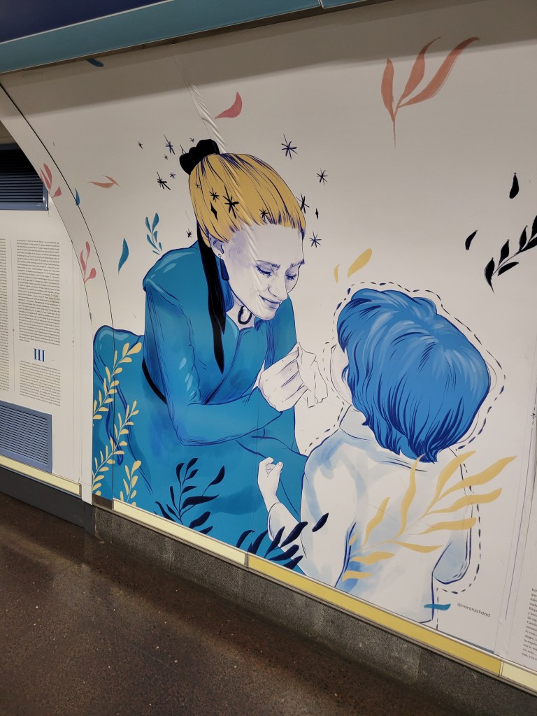
The final panel shown here continues the blue hues, but infuses gold as Jacinta’s hair and the flowing movement of love (?) through the child Juan Evaristo Segismundo. Jacinta’s movements indicate love or tenderness by providing a handkerchief to wipe the child’s tears, since he has lost his real mother Fortunata.
While the panels show scenes from a literary tome familiar to most Madrileños, the artists’ use of color, perspective, apparent movement appear to convey a visual vocabulary that was somewhat understood by this American with no cultural context of the story or the characters. Truth in advertising – if I had learned the basic amount of Spanish implored by my high school teachers, the entire text of the book is printed along with the drawings. To their credit for small font size, the whole book is represented along the walls of the subway station.
Module 4 -Semiotics and Reading the Signs

Daniel Chandler’s “Semiotics for Beginners” helped me decode this image I took in Valencia Spain in 2024. While the art exhibit had a theme (I won’t share it just yet), the image above was created in such a manner that pushed Peirce’s ideas on semiotics straight to the forefront (with Chandler’s verbose explanations).
I wrote these quick definitions down from Ferdinand de Saussure to help build my vocabulary, so I offer them here as a reminder while I type:
- Likenesses or icons – convey ideas by simply imitating them
- Indications or indices – shows something on account of being physically connected (guidepost)
- Symbols or general signs – associated with meanings by usage (phrases, words, speeches, books)
The obviousness of the art shows both the signifier – the ABCs of [redacted] in an alphabetically-arranged array – and the signified – the concepts that are represented within each alphabet character block. Without the “In Felicidad” at the bottom, the drawings would vacillate between icons (representing or imitating) and symbols (things that must be learnt, such as the black skull representing death). The alphabetical arrangement gives an example of indexical layout for the letters themselves, but not the concepts, unless you tie together the Spanish words for the concepts represented. I am reminded yet again that I should have learned Spanish those decades ago… 😦
The art exhibit’s theme was Happiness/unhappiness from what I could gather from this and other exhibits. The alphabetical arrangement, in Spanish, shows icons and symbols of items that make humans unhappy – “D” with a sack of money for dinero (money), “E” and the electronic “play” button representing entertainment, “F” and an almost universal image for fumar (smoking). These icons and symbols are not universal – ask a native living in the rainforests of South America what they mean – but are mostly recognized by the Western world. “I”, “L”, “S”, and “T” still befuddle me.
I knew enough of these to partially decrypt the meaning, and my holiday knowledge of “Feliz Navidad” lyrics – along with the “en/in/ente/contra” to know it meant “against” or “opposite,” allowing me to understand the unhappiness aspect of the artist’s message. Yet choosing these symbols, icons, and indices provide enough of context to a receiver (me) whom did not know the language represented, yet got the understanding anyway.: “ABCs of Unhappiness” it is to the Neanderthalic American.
Module 5 – Visual Rhetoric, or “Is what I see really what I get?”
I really liked this chapter within the Kimball and Hawkins book. Probably because I’m a tech geek and have a heckuva time designing documents for a general audience in my discord community (“navigation warfare” if you were interested). The idea of using document design to push ethos, pathos, and logos is my daily struggle at work. But today I will skip the document part and just focus on technical communication, specifically language training through an online learning app called “Drops”

What can I say, that won’t repeat the design and page layout descriptions of Kimball and Hawkins? The app – aside from the Barney purple – has got great design to help with:
- efficiency – I can find things easily, and need to click on anything in the horizontal realm near the image or progress bar
- memorability – the images used are simple and I can easily remember the image with the concept being taught. I can remember a person graphic pointing to himself under the semiotic symbol for a map location (“hier”) in juxtaposition to the same map symbol away from the person with them pointing towards it (“dort”). It also doesn’t hurt that “hier” sounds like the English “here” where the dude is. (score one for the German language)


- error avoidance – success comes when this idea/symbol is mixed in with others, and the iconography helps with determining what concept is being matched with what word in German. Some of the images are trite, while others are a bit memorable (not shown here).
- subjective satisfaction – I’ve used Drops for learning German for six months and will attest to its ability to convey written/spoken language concepts into my brain to survive a trip to Germany and back. Simply put, the app did what it advertised it would do – increase my vocabulary.
Drops was designed with the skim, scan, and read model by providing limited information and graphics if I choose to skim; within other portions I can scan the page to see what concepts match with the words presented; and if I am intensely curious, I can read more about where the word came from (see bottom of images for etymography, or word origins, to further the concept sinking into my brain).
While I’m geeking out with the Kimball and Hawkins descriptions, I know from past experience trying to make Web 1.0 sites that these graphic design choices are hard to make things look good. I’m not a visual person, so when making the choices, I often look at what has worked in the past for similar material and end up copying it. Drops did not copy the designs of similar language apps – Duolingo, Babbel, or Lingvist – and I think that is one of its strengths by providing technical information in a way that succeeds at its stated purpose: only building vocabulary.
Module 6 – Acceding to Infra-knowledge
Ah! There is a word, or hyphenate, that describes what I attempt to do in my picture books: infra-knowledge (!) I use photographs in the way that Barthes describes them in section 13, trying to find out clues about the how’s, whys, when’s, and (maybe who’s) for the historical captions that I write. I agree that photographs show these details better than paintings, because the artist derives the scene for the Spectator and shapes the punctum for us, as well as the studium. Within a photograph, the photographer can (and must) do the same, the captured details are… well, they are what they are. A moment in time frozen for future discourse.
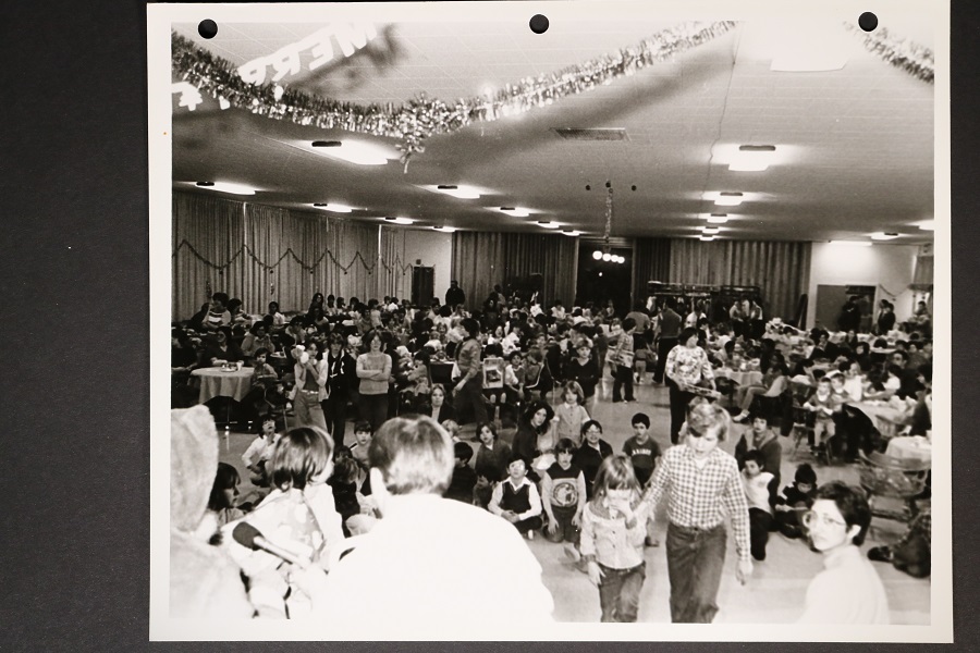
Christmastime, circa early 1980s. A town, or gathering of people, within North America. What other inferences can I draw from this photograph (the previous facts are meta, known from where I got the image from). Decorations abound representing typical paraphernalia for the season. Majority of young individuals – children – gathering in a large auditorium or room. Most of the children are Caucasian, with a few Black kids in the audience.
But what else can this image tell me? On the outset, not much. The statements above are based on observation of what is in front of me. The meta information (not quite metadata) is informative to allow me to draw inferences… that infra-knowledge… about the place, time, denizens of the photograph.
I play this game with every image I’ve used in my books. Guess who this is? I don’t know. What are they riding in/on? I don’t know, but the serial number on the craft is present, so I can Google it. Where are they at? I’m not sure, but I can likely track down the building number or latitude/longitude.
Like Barthes, I like knowledge too. My messy office can attest to that, much to my researching detriment. But my draw to knowledge is less philosophical – on the outset – than him. I am drawn to information to tell a story of a time, a place, to push an emotion out to a Spectator. I don’t often provide punctum, as my artistic skills are not up to snuff, but I can provide studium in droves, melding pictures and words.
(Answers to the above: Children’s 1982 Christmas party at Loring Air Force Base, in Northeast Maine. Was not used for my Loring Air Force Base Through Time book because it offered very little punctum to a book full of studium. I had the choice to provide a picture of kids at a Christmas party or use a B-52 nuclear bomber in flight. The other image provided the punctum required for the pictorial history book.)
Module 7 – A Pictorial Turn into the Meta-Verse

Oh, I love the language used in WJT Mitchell’s article “The Pictorial Turn.” The shockingly drawn conclusions on the future “dominated by images,” does scare me a bit, as I’ve been (like many other Americans) a rabid consumer of images over the past three decades. The comparisons between the Gulf War in 1990 and the Invasion of Iraq in 2003(-????), juxtaposed against each other and the Vietnam War are striking, apt, and make me a bit sad that the dumbing down of the population may be due to this rapid influx of visual media. Who knows when World War III will start?… but we know it will be posted to Instagram or Twitter (I refuse to call it X, for common sense reasons).
I’d love to know exactly what a post-linguistic or post-semiotic rediscovery of the picture really means. We use images all of the time, and semiotic analysis is constantly happening, yet we’ve not gotten beyond linguistics in the oral or written sense. I fear that if we reach the post-linguistic or post-semiotic level he espouses here, we will be no better than the Eloy in H.G. Wells’ “The Time Machine” – frail, clueless creatures with no imagination, or ability to survive without the assistance of a damning population of cannibalistic beasts.
Ok, maybe humankind won’t go that far.
Oh, my brain is strained from the images in Picture Theories. I just asked my children which they could see immediately: duck or rabbit; old or young woman; cube up or down. I had to look up Las Meninas, as the B&W image didn’t define much – Oh, there were so many paintings I must have missed in the Prado…
Magritte’s “This is not a pipe” provides another swirling of grey matter on par with the images from MC Escher and how worlds are created that could not exist in 3-dimensional reality.
“Knowledge itself is a system of archeological strata ‘made from things and words… from bands of visibility and bands of readability.'”
From what I’ve learned of Belgian culture, Magritte’s other pipe drawing would surprise no one. I have no written comments on this drawing , so I offer this emoji:
:-0
Module 8 – TBD.